Bison App: Clustering Data Gathered During Interviews

Summary
Context
- Bison is known as the number one app for beginners, who start investing in bitcoin in Germany. I use the app regularly myself and had this feeling that some aspects of the user experience could be improved. To find out, I created an interview protocol and interviewed some subjects.
Problem
- What are the main obstacles found by first time users who want to start using the Bison app?
Goal
- Find out improvement possibilities in regard to the usability of the app Bison.
Process
- Creating an Affinity Wall, which is the sorting and clustering of relevant information collected during the interviews.
Results
- I found two main issues. The detailed results are found below.
Affinity Wall

Findings
During my research I've found two main issues, which I like to express in questions:
- What are the main usability issues found in the interview?
- For what kind of user was the app developed?
Usability issues
Let's start with the Demo Mode. On one hand, it makes sense to offer a demo mode for investing with an app in such a new asset class. People are always afraid to lose money, so it seems reasonable at first to allow the user to simulate.
The problem is that this approach raises a lot of issues.
I also think that maybe the whole color pallet of the app could change when switching from demo to/from real money trade. This would make the state of the app obvious and instantly understandable.
Another issue is the idea that the demo mode comes with money already deposited (50.000 Euro). Some users didn’t understand that.
From what I saw, I believe that encouraging the user to invest a small amount (5 euros) could work better. This would make the effort of registering worth it.
The second point is the Crypto Radar feature. The users didn’t know what to do with the information provided by the radar. It shows that the market is excited or more negative towards a certain coin. The feature doesn’t seem to provide any useful information, besides market noise.
The Transactions History feature also raised a lot of questions regarding the usefulness of the info provided. The users wanted to know the ROI (Return Of Investment) and filter the transactions by time. I imagine that some of these new filters could be displayed as dropdown menus.
The interview also brought up some minor usability issues, such related to the meaning of technical terms (open P/L), font sizes, and the understanding between what amount was invested and what wasn’t. Some examples follow:

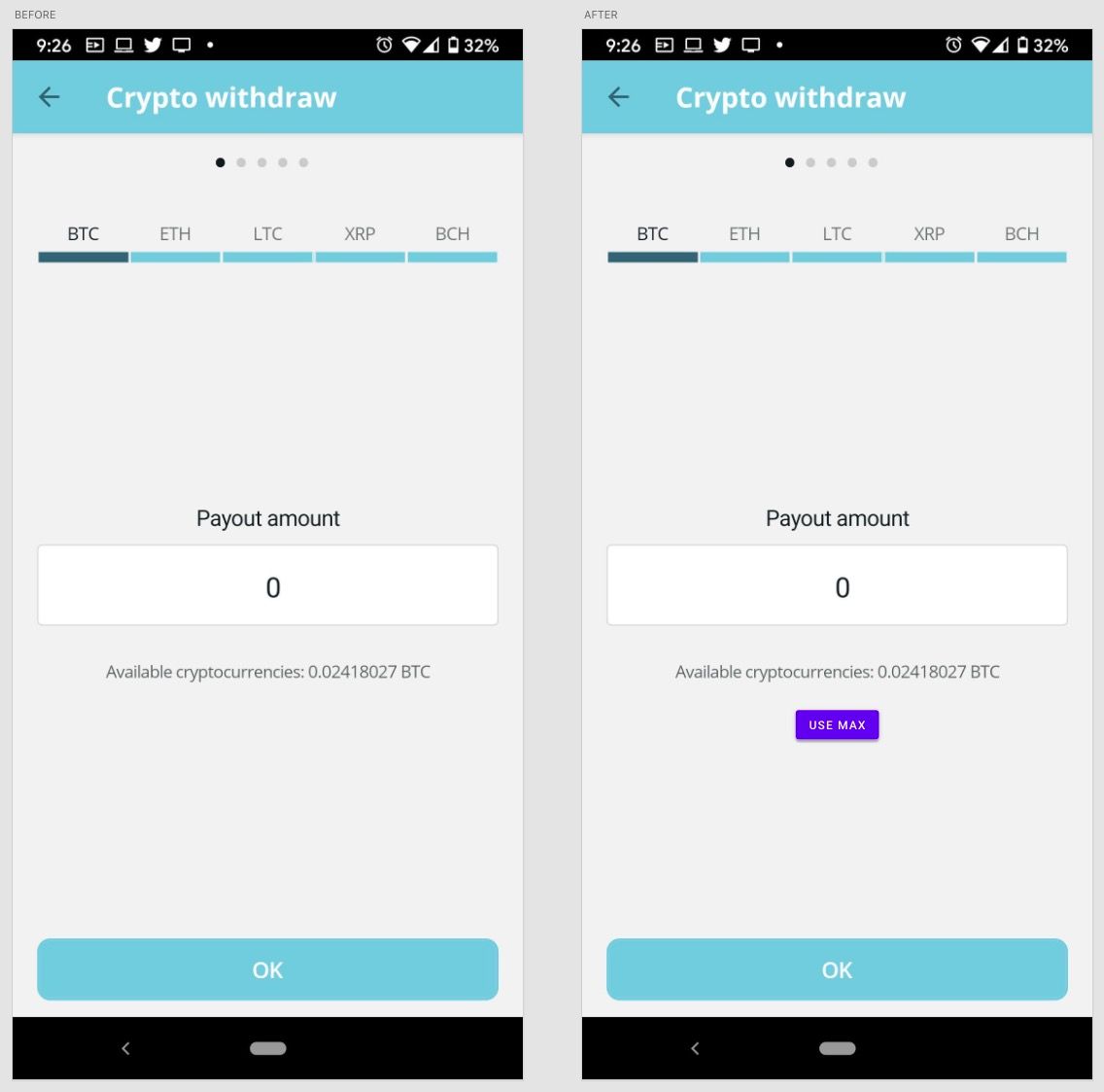
The added USE MAX button could allow the user to use automatically enter the full amount of the wallet into the field, without having to do it by hand.

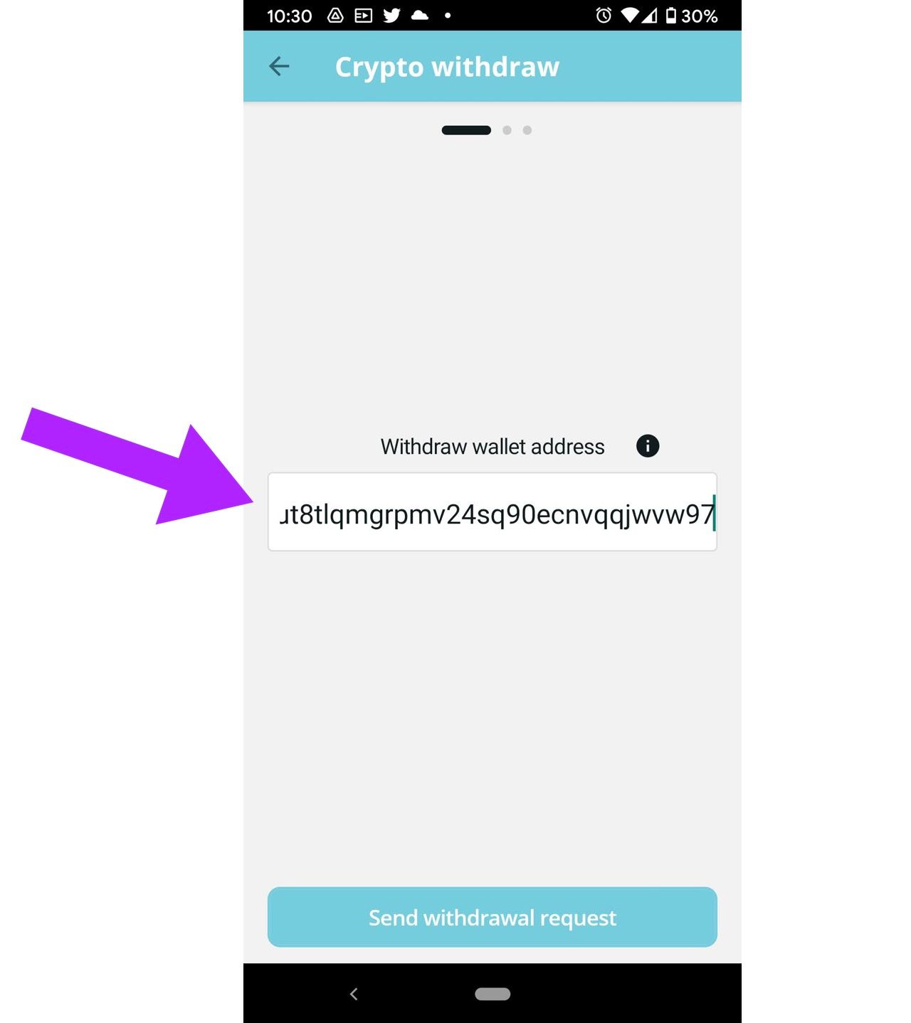
In regards to this address field, I would have two recommendations:
- It should allow the user to verify the completed address, from the beginning to the end. Yes, everyone will be copying and pasting it from somewhere else, but it is crucial to make it possible for the users to check the first and last characters without requiring them to drag the cursor through the field, mostly to avoid possible
- In order to increase the legibility of the address, it would be helpful to change the font to a san serif monospaced font. This would help the users to distinguish clearly between often mistaken characters, such as 0 (zero) and o (letter).
Target group issue
To end this report, I would like to bring up the deeper subject of the profile of the user for this app.
- Was the app made for Bitcoin 'hodlers', that intend to buy and hold for the next 20 years? Or it was developed to beginner trader, that just want to get a taste of what it feels like to trade crypto?
Some questions that I raised were the following:
- What is the time frame that the users intend to invest? Long time investors vs. Trader
- How much and how often do they intend to invest? Small amounts monthly vs. Large amounts every year
- Which features are the most relevant? Privacy, Law and tax compliance, etc.
Investors in cryptocurrencies can have completely different expectations and approaches. I recommend creating some personas and developing the app around the needs of these characters.